
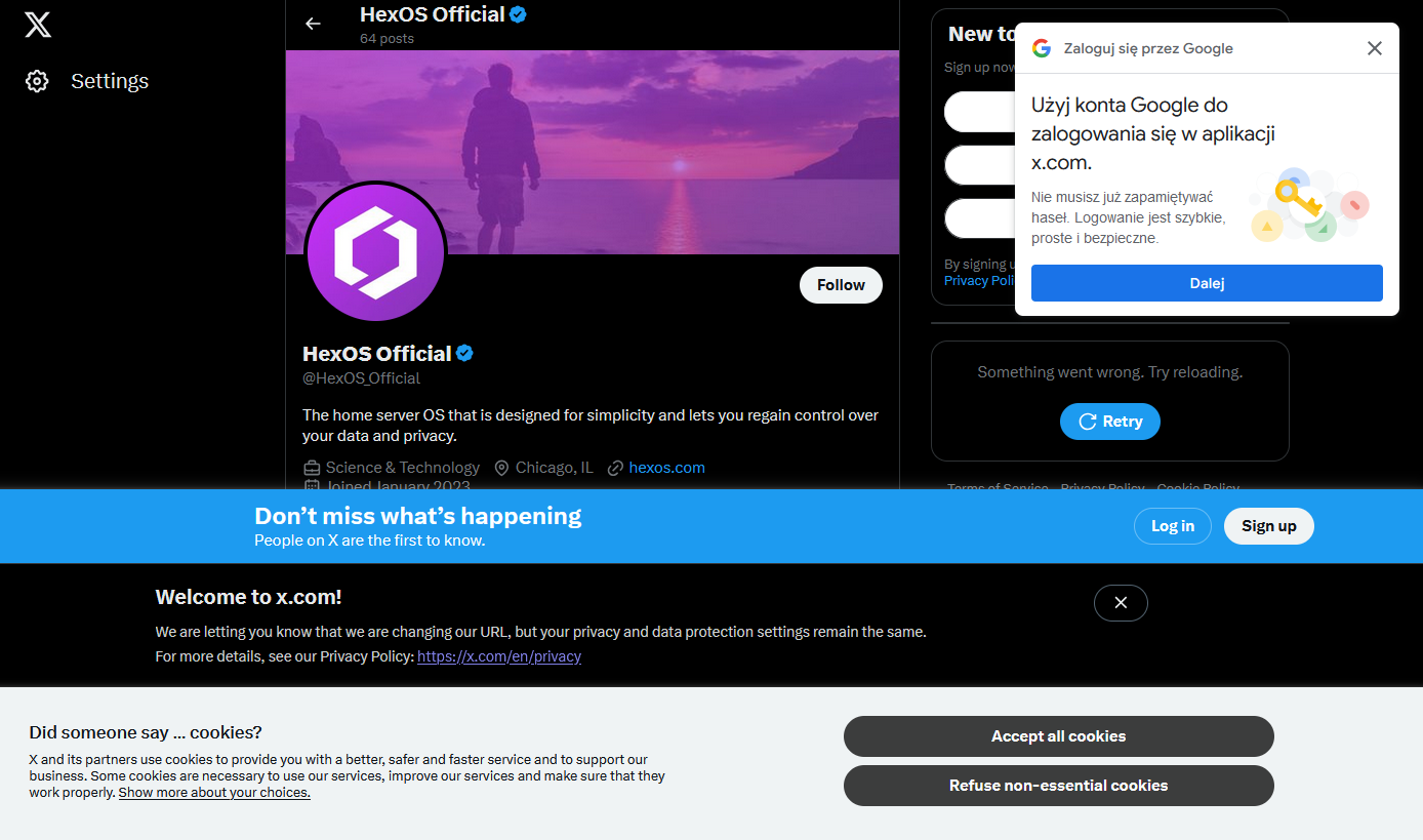
I happened to click a link that took me to the associated twitter X account for something I was interested in and was greeted by not one, not two, but four modern day web popups.
I know it’s nothing new. I’ve got a couple of firefox plugins that are usually quite good at hiding this sort of nonsense, but I guess they failed me today (or, I shudder to think, there were even more that were blocked, and this is what got through)
What’s the worst new/not-signed-in user experience you’ve encountered recently?
That white text on gray background. What a design choice.
Aesthetic > readability. The user can just select all on the page if they want to actually read it, right?
Edit: It was pointed out to me that this brings up a random URL every time someone clicks it, so everybody is not seeing the same thing. Whoops.
Every time you click that link you will get a different web page… so…
Oh, I see now. I’m dumb. I didn’t realize this just brings up random URLs to web 1.0 pages. Thanks for pointing that out!
Although if you click through a few of them, your comment is probably applicable!
I still prefer readability over aesthetics. There’s many people with disabilities that I hope you never get through what they do. If there’s something to be read that you can barely see, then what would be it’s value?
I should have put a /s because the comment about aesthetic over readability was sarcastic. I was just joking, and I definitely agree with you.
Oh, thank you for the clarification, didn’t wanted to sound mean.