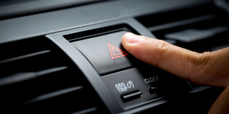
No one ever requested screens instead of buttons. It’s probably some BS some CEO came up with and forced the engineers to implement.
Touch screens should not be used for any controls needed to operate a car. You can’t use them without taking your eyes off the road.
Technically the only thing you’re allowed to fiddle with, while driving, is what you can operate from the steering wheel. You’re not supposed to fiddle with radio, AC etc. from the center console while driving even if it’s physical buttons.
I know people don’t drive like this, but you’re only allowed to take your hands off the steering wheel for changing gears if driving a manual, otherwise it’s two hands on there at all times…technically
If you read the article this is specifically about things needed to operate the car. Radios and AC or whatever is fine, but car manufacturers are starting to move things actually needed like turn signals into touch controls, and that is not okay.
Tesla’s Model 3 uses a touchscreen for damn near everything. Some things are buried and require multiple presses in different places on the screen. It looks really good, but the actual purpose and the fact that humans driving at potentially deadly speeds need to operate it seems to have been placed a distant second to safety when the thing was designed. Given who is in charge of Tesla it’s not much of a surprise.
it *used to look good, but then they fired the former-apple designer and hired some hack who worked on android, and it looks god awful
before: https://www.teslarati.com/wp-content/uploads/2019/04/model-3-ui-1.jpg
after: https://miro.medium.com/v2/resize:fit:1400/format:webp/1*zNdNui2-s30EEAqCDy8vRA.jpeg
This is a win for consumers, touch screens are bloody awful when driving and take away far too much of your concentration
IMO the capacititive buttons with no feedback are even worse than the touch screen. at least with the touch screen, you will likely have a colored UI element on screen to press. with the cars that replace all the buttons with capacitive buttons with no feedback, theyre all the same color.
no feedback? 🤔
either the button or an indicator lights up or you see/hear what the button is supposed to activate or stop
*haptic feedback. The touch and press should be two different actions, not the same action. Otherwise, you need to look at a button to know where it is and if it did what it was supposed to do, which distracts you from driving.
Touchscreens are not that much better in this regard, IMO
I’d be fine with one that works like the Taptic engine on iPhones or how ever the trackpad on my Macbook does. It’s a solid surface with no moving parts but it clicks when you press it and it feels 100% the same as pressing a physical button. It’s way different than haptic feedback done with just the vibrator motor.
That doesn’t work well in a car though. It works in a phone because you’re holding it, or a trackpad because you’re putting a lot of pressure on it. In a car it’s already shaking from the engine, road, etc. Plus those taps are generally much shorter and lighter and less likely to feel the vibration.
Just have it swerve when you press a button!
the 2010s was a mistake


